Have you ever glanced at your website analytics and felt frustrated? Especially when you’ve spent hours pouring over your content only to have people leave. The hard truth is that average conversion rates are only about 2.35%. That means out of 100 visitors, only a handful are turning into leads or customers. Painful, isn’t it? But what if there was a way to transform your landing pages into compelling narratives that not only grab attention but also prompt visitors to click, sign up, or buy?
The science of high-converting landing pages is a game changer that could turn this all around.
What is a High-Converting Landing Page?
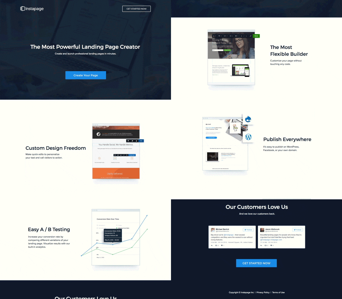
High-converting landing pages are the superstars of any successful online business. They’re not just ordinary web pages. Instead, they’re specifically designed to convince visitors to take a particular action – be it signing up for a newsletter, downloading a guide, or making a purchase. Whether you’re selling products or offering services, these landing pages do the heavy lifting, turning a curious browser into a committed customer. They’re like your most persuasive salespeople, working tirelessly around the clock to help convince visitors that what you’re offering is worth their time and money.
Core Elements of Effective Landing Pages
- Clear and Engaging Copy
- Strong Call-to-Action (CTA)
- Visual Appeal
- Trust Indicators
- Easy Navigation
- Value Proposition
- Mobile Optimization
The Psychology of Conversion
What exactly prompts a person to make a decision online? Why do they click, download, or buy? Understanding their motivations, needs, and pain points can arm you with a weapon – the power to persuade. Anticipating customer behavior is like piecing together a puzzle. Each piece, from understanding their needs to addressing their concerns, creates a complete picture that drives action.
It’s about creating an environment on your landing page that resonates, builds trust, and ultimately convinces visitors that choosing your service or product is an effortless decision.
Components of a High-Converting Landing Page
Creating a successful landing page starts with an eye-catching headline and engaging body text. Your headline should instantly grab the reader’s attention, sparking curiosity and getting them to want to learn more. The text that follows should speak directly to your audience’s needs, showing how your product or service can help them. Both elements play a crucial role in convincing visitors to take the next step.
Credibility Boosters – Testimonials and Reviews
In the digital world, trust is paramount. Your landing page can build this trust by featuring elements like customer testimonials and reviews. This shows prospective customers that your product or service is reliable and highly valued by others. Endorsements from reputable sources or case studies can also make a significant impact, enhancing your page’s credibility and potentially driving more conversions.
Eye-Catching Calls to Action
A strong Call-to-Action (CTA) button plays a pivotal role in guiding visitors to the intended action, be it buying a product or signing up for a newsletter. It needs to be visually distinct and contain simple, persuasive text that entices users to click. Experiment with different colors, sizes, and placements to create the most effective CTA.
Mobile Optimization for Easy Access
In today’s world, people frequently use their smartphones or tablets to access websites. Therefore, it’s critical your landing page is mobile-friendly. It should have a responsive design, feature easy-to-read text, and buttons that are touch-friendly. Providing a seamless mobile experience can help increase your page’s conversion rates.
Visual Appeal with Relevant Images
Including relevant, high-quality images or videos can immensely enhance your landing page’s visual appeal. It not only add aesthetic value but can also help illustrate your product or service’s features and benefits. Plus, they make it easier for visitors to connect with your brand, potentially leading to more conversions.
Improve Your Landing Page Conversion Rate
Optimized Messaging
Craft copy that connects emotionally with your audience’s core desires and frustrations. Emphasize how you solve their pains and convey benefits clearly. Use conversational language that sounds human. Headlines should create intrigue. Address key questions and objections. Build a bond and trust through messaging.
Prominent Calls-to-Action
CTAs should use commanding action words and contrast colors drawing the eye. Give clear next steps like “Sign Up Now” or “Start Free Trial”. Use directional arrows pointing visitors to click. Avoid vague terms like “Submit” or “Learn More”. Make forms short with only essential fields. Remove all obstacles between visitors and converting.
Responsive Design
Ensure your page looks phenomenal on mobile. Check loading speed on all devices. Simplify layouts and navigation for smaller screens. Use clickable buttons instead of hover menus. Content should be easily scannable. Mobile experience impacts over 50% conversions now.
Relevant Visuals
Images and videos should help tell your brand story visually. Infographics can explain concepts clearly. Show real people enjoying your solution. Convey emotions like happiness, success. Minimal stock photos – prioritize authenticity. Unique page illustrations engage visitors.
Urgency and Scarcity
Trigger action by highlighting limited time offers or inventory. For example “24 hours left for 50% off”. Use countdown timers to spark immediacy. Limited time discounts incentivize signing up quickly. Remind visitors the exclusive deal won’t last forever. Apply a bit of pressure.
Conclusion
Optimizing landing pages may seem complicated, but following the methodology we’ve covered will set you up for success. Focus on truly understanding your audience, crafting a focused message, and guiding visitors down the conversion path with clear calls to action. Test and refine based on data. With this approach, you’ll be designing high-converting landing pages in no time.

